The Truth about Full-Time Jobs (when you have a side hustle)
| Growth
Data by itself is useless.
Your job as the presenter is to help your audience cut through all the noise and interpret the data in a meaningful way.
So in this post I’m going to share my top 7 tips when it comes to visualizing data, incorporating charts and graphs into your presentations, and telling a persuasive story!
Never present a single number since it gives the audience no context. Let’s say the iPhone goes on a huge sale for 5,000 USD and in one quarter they sell 10,000 units.
Is that good? Is that bad? You have no way of knowing unless you compare historical performance.
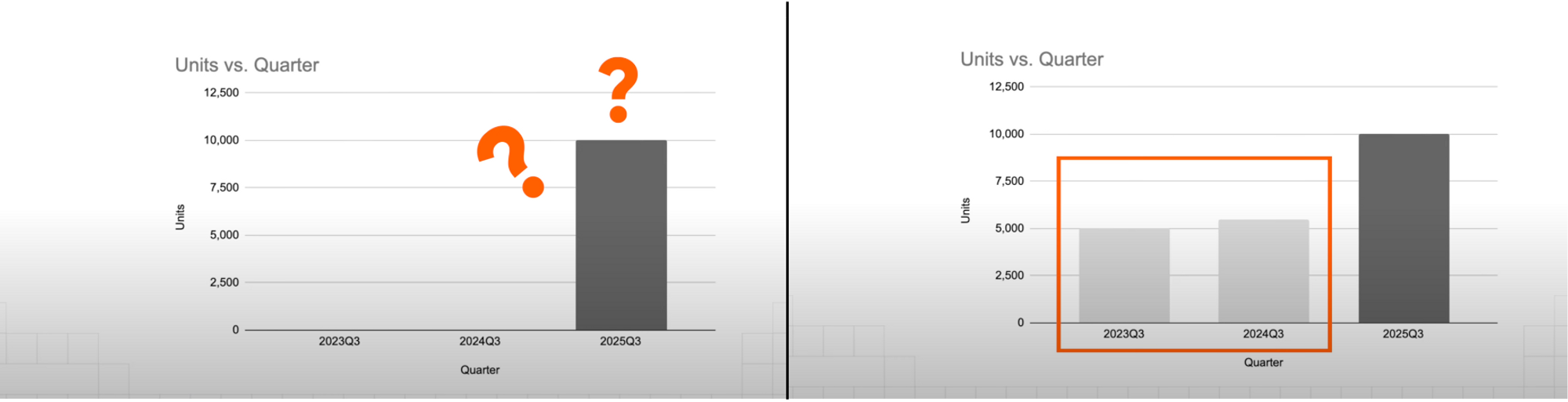
If you don’t have access to historical data, the next best thing is to use industry benchmarks to make a comparison. Remember, any number is better than nothing when presenting data.
This is because our brains are wired to recognize patterns, and we immediately pick up on things that are out of the ordinary. Leverage this behavior to easily focus your audience’s attention on the one thing you’d like for them to take away.
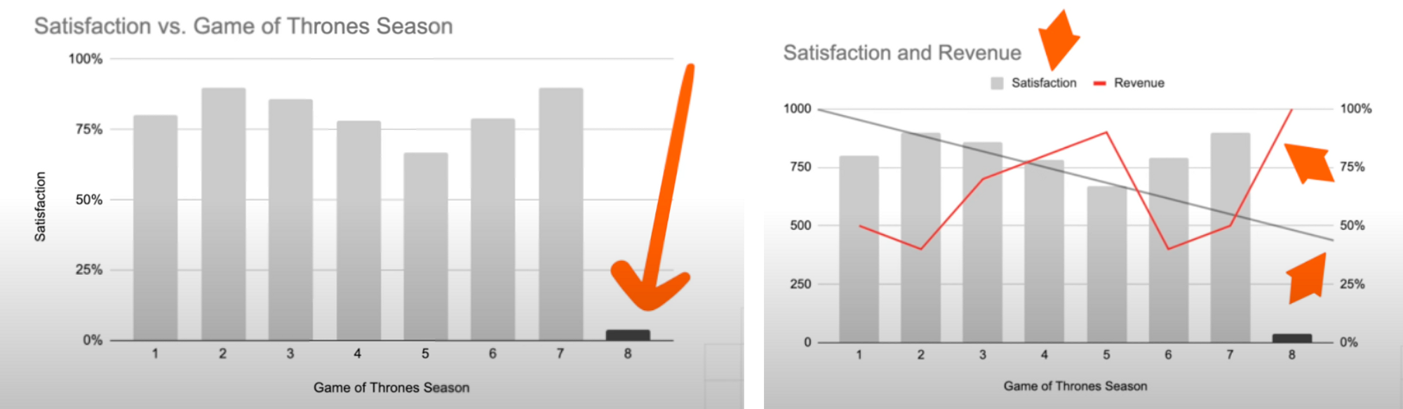
To give a counterexample, the right chart only has 3 elements, but our brains still struggle in the first few seconds to really understand what’s going on.
This tip does not hold true for decks designed to be standalone. There are those presentations that contain a lot of words and elements on purpose, because it’s supposed to be circulated within the company and be understood with no context.
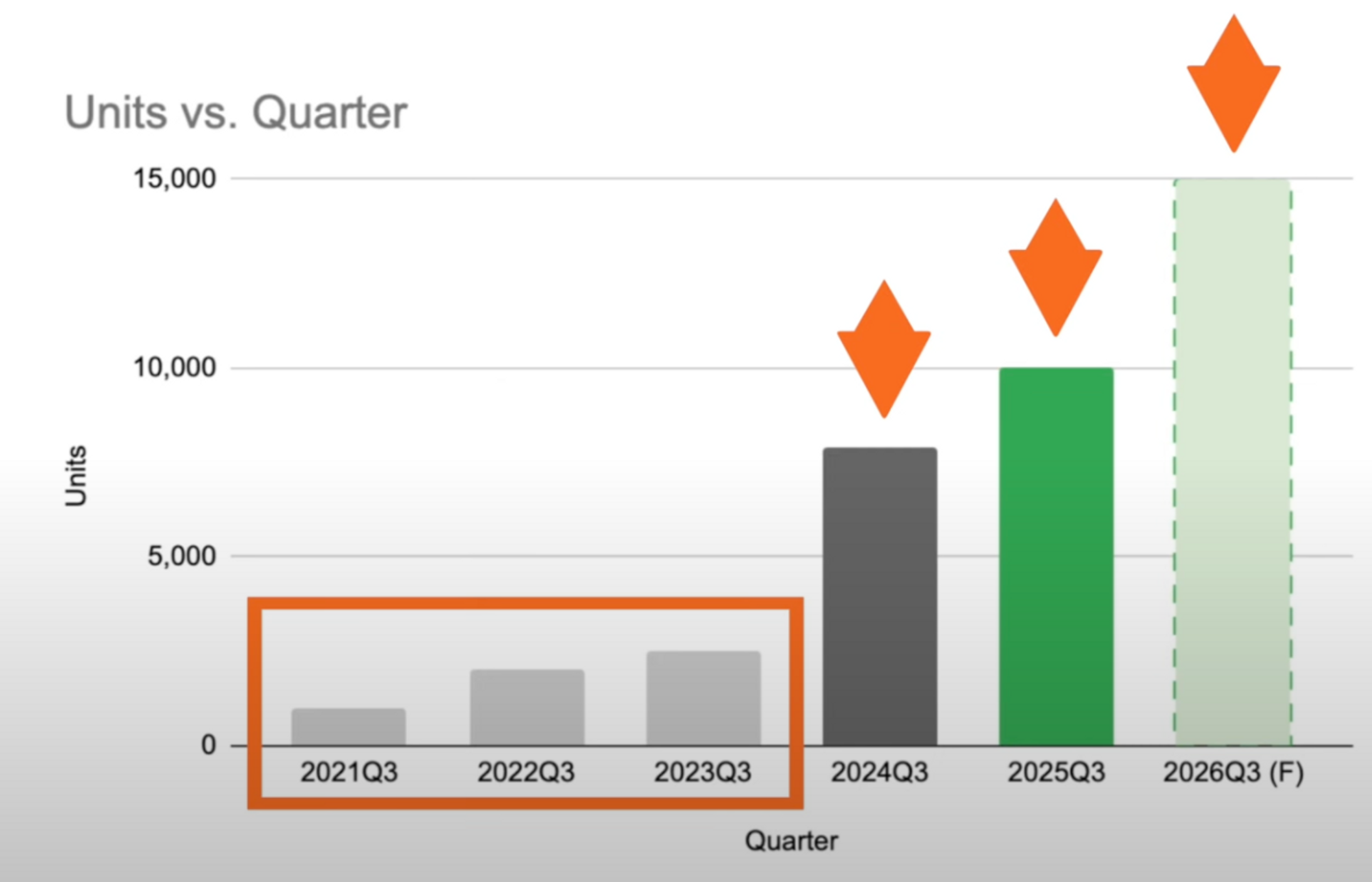
This is actually my favorite one and that is to use colors to provide contrast.
Back to our brains, we’re actually better at identifying colors than shapes and for the previous graphs we’ve seen so far, just by adding color to highlight the main focal points, we have dramatically increased the effectiveness of our message.
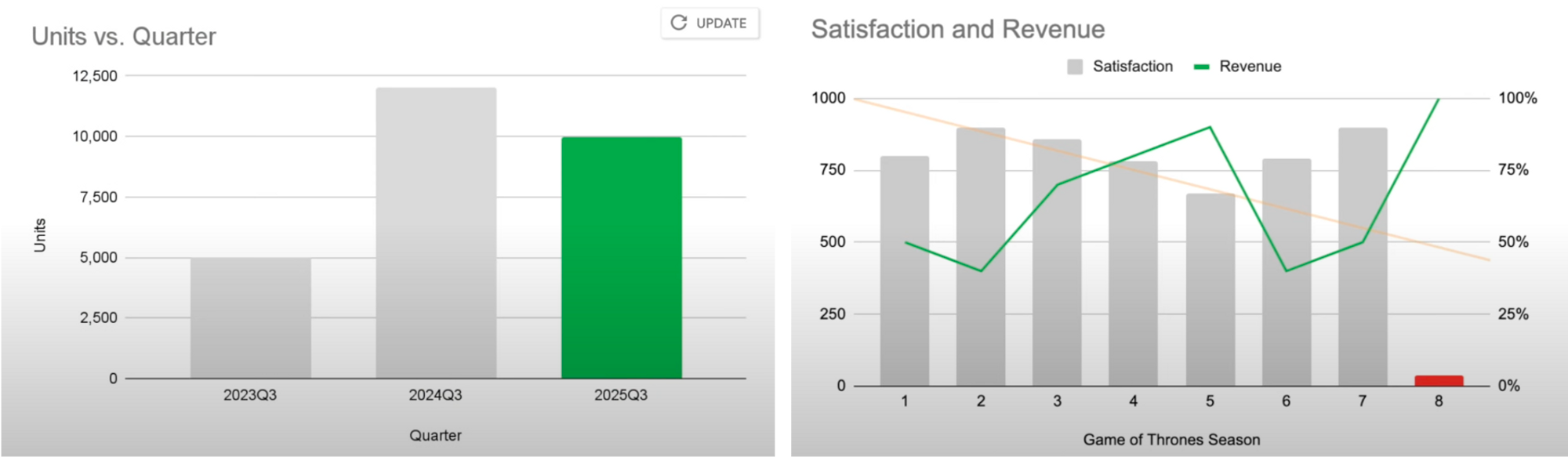
The next example shows what I like to do is to use light gray for earlier data, dark gray for the last most recent, my company’s brand color to highlight the most current information, and a lighter shade of that for forecasted numbers.
This makes it very intuitive for the audience to understand the relative importance of the information they’re seeing.
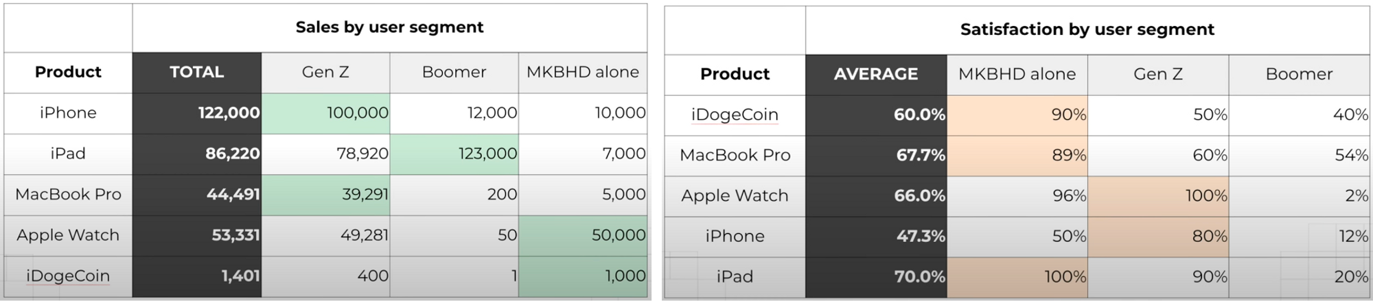
For example, you can see at the left example I used green to highlight the highest numbers here, and the products are listed in descending order, from the most sales to the least. The next table not only uses a different color to highlight the highest percentages, but also changed the order of the headers as well.
This can be very disarming to the viewers who again are looking for patterns and consistency.
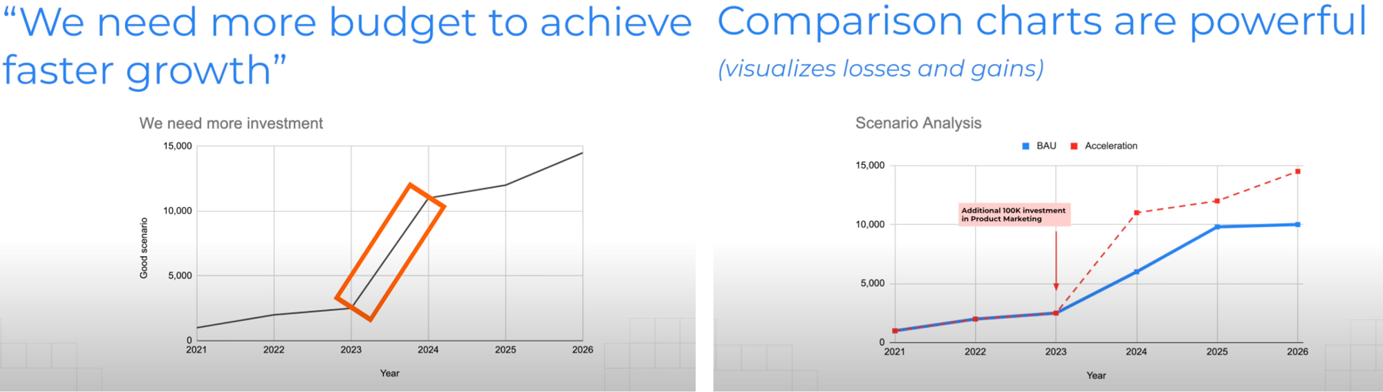
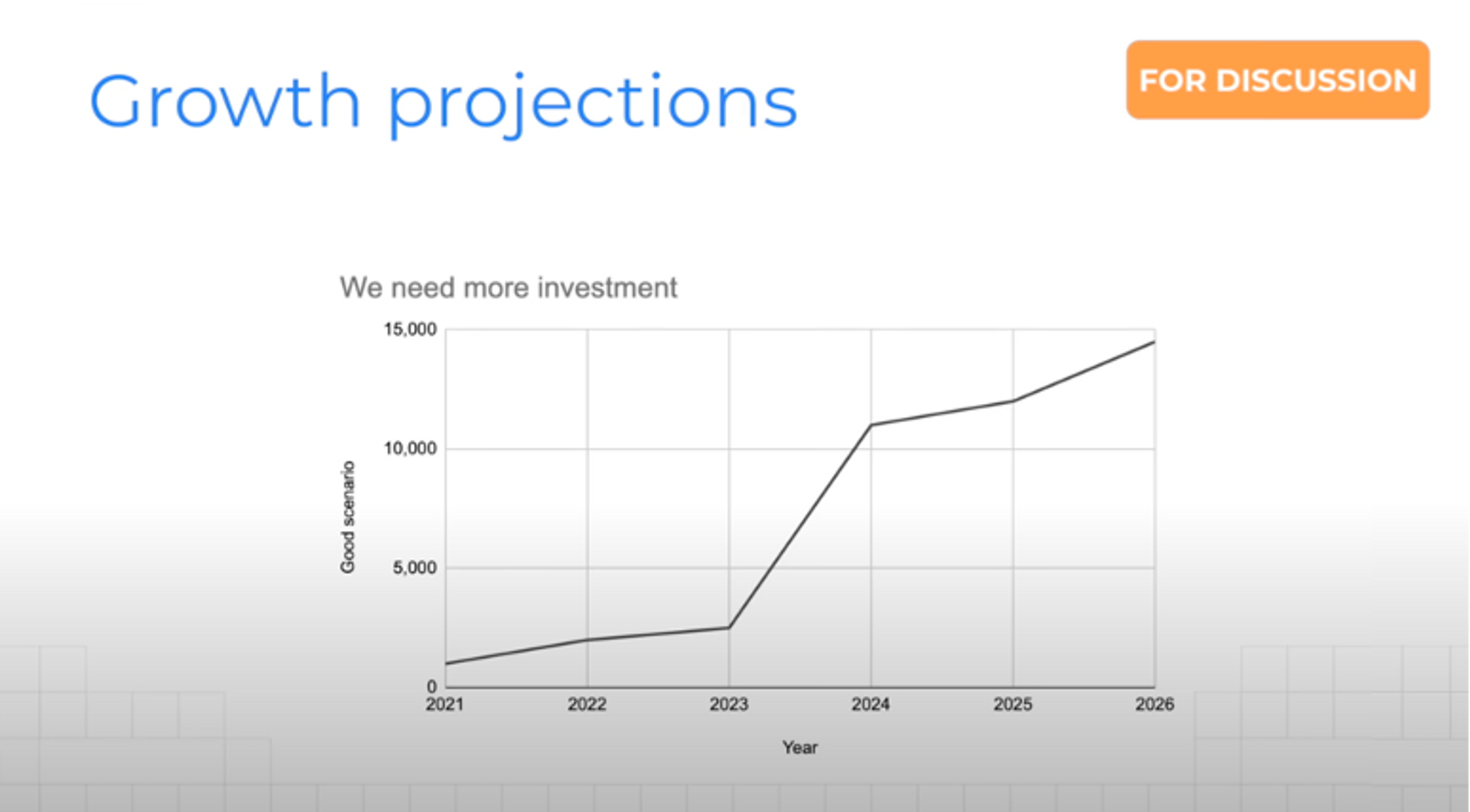
This is extremely useful when pitching a business proposal or asking for additional investment, and that is to use something I call a comparison chart.
Yes you can create a simple line graph to visualize the growth you would achieve if you were to receive more support. But why not take it a step further and show the Business as usual (BAU) and the Acceleration scenarios side by side.
Apparently you’re never supposed to use pie charts, I don’t know why but there is actually a saying “friends don’t let friends use pie charts” so stay away from those.
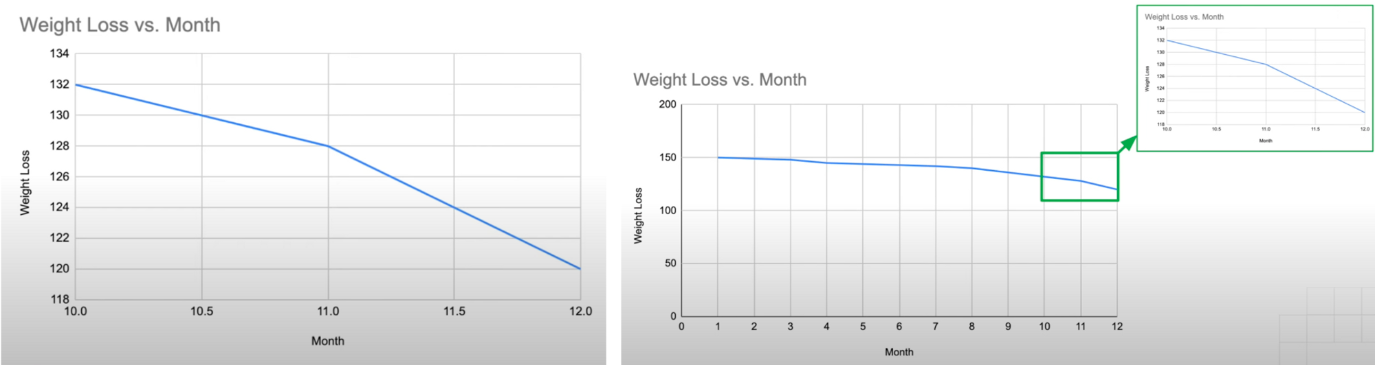
Line graphs are great at showing changes over time. The one thing to note here is to not manipulate the axis to fit your agenda.
However, if we were to zoom out, we see the larger picture, there is a gradual weight loss over the course of 12 months. The rule of thumb here is to start from 0 if you can, then zoom in on a specific section if need be.
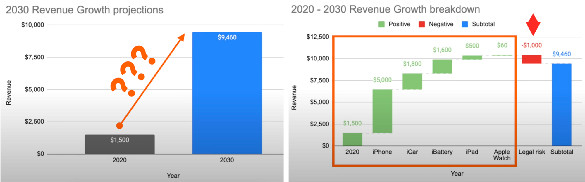
My personal favorite, we loved using this back in my management consulting days because waterfall charts are amazing at showing how 1 number relates to another.
In the waterfall chart at right, we can clearly see the key factors that contribute to this change. How much each product SKU is going to grow, and we even see here that there will be downward pressure stemming from legal risk, something the audience would never get from a simple bar chart.
So if you’ve ever seen something like this in a Google Slides or PowerPoint deck, you know what I’m talking about. WIP stands for Work in progress, so if someone clicks into your presentation and it’s not done yet, they know it’s still in progress.
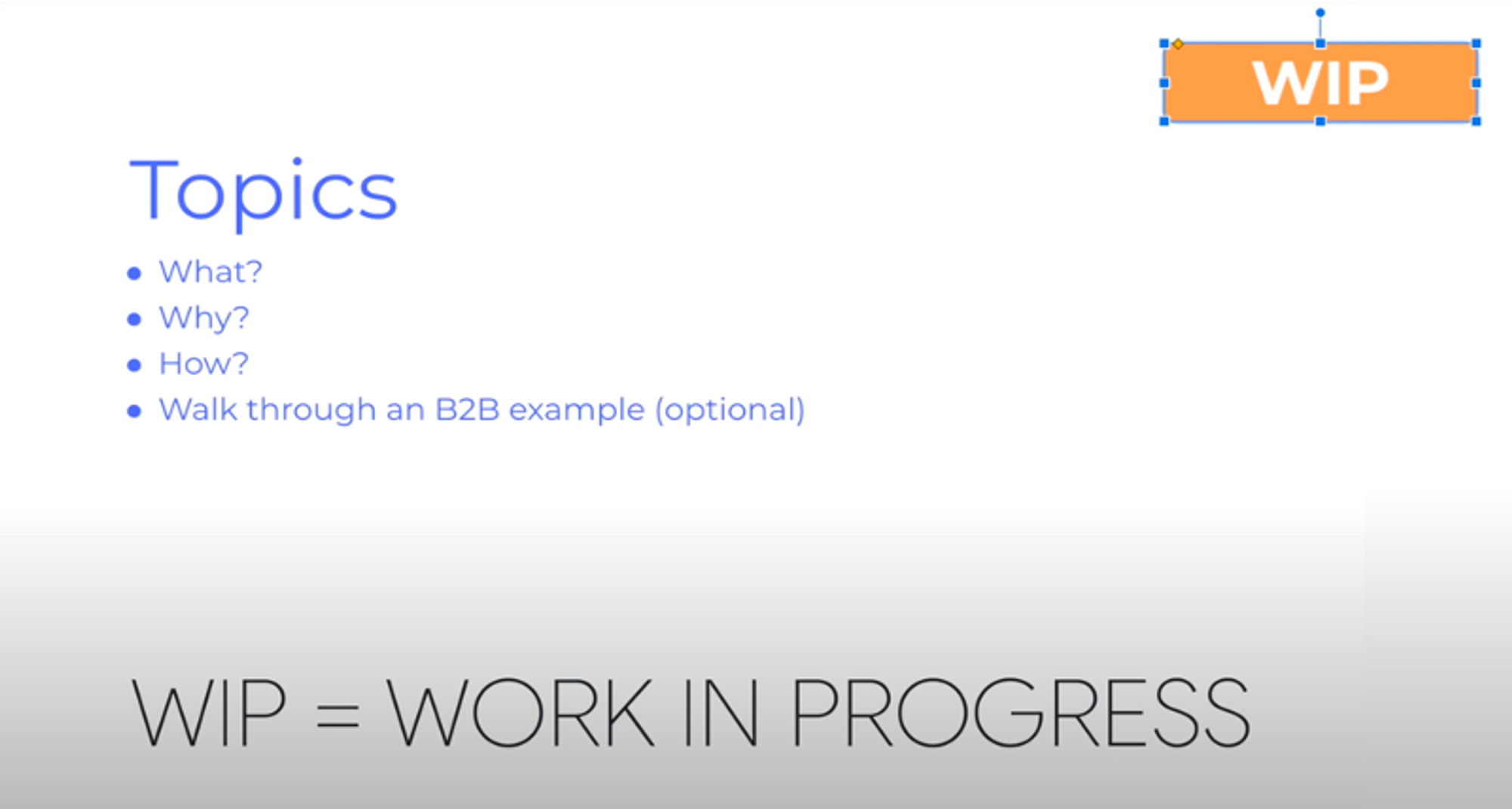
This usually means it’s a very rough first draft you might need someone like your manager to review and let you know whether any changes are needed.
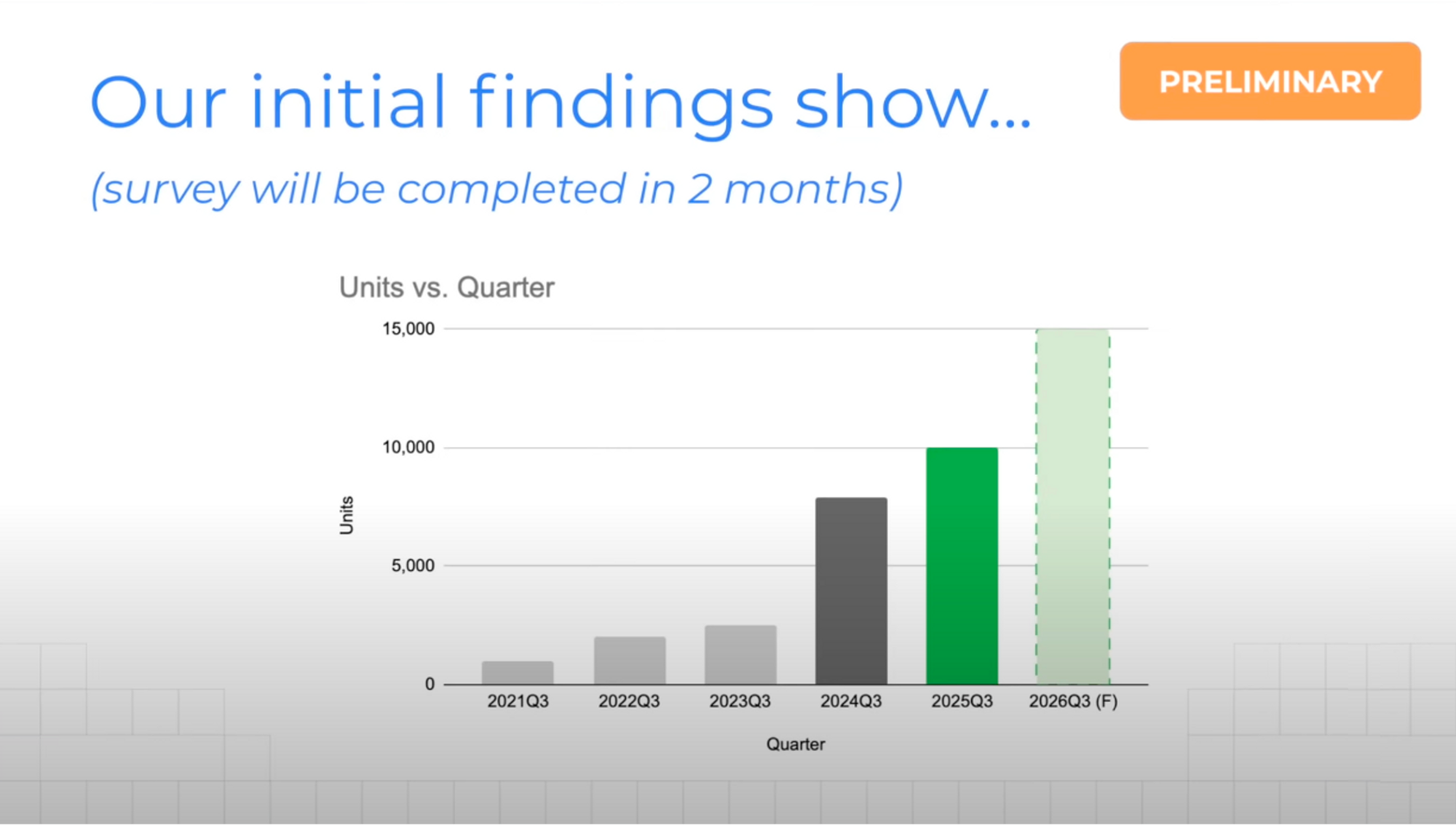
Preliminary sticker means the slide itself is completed, but the data within is still ongoing. For example a market survey is still going on, but you’re presenting your initial findings so far.
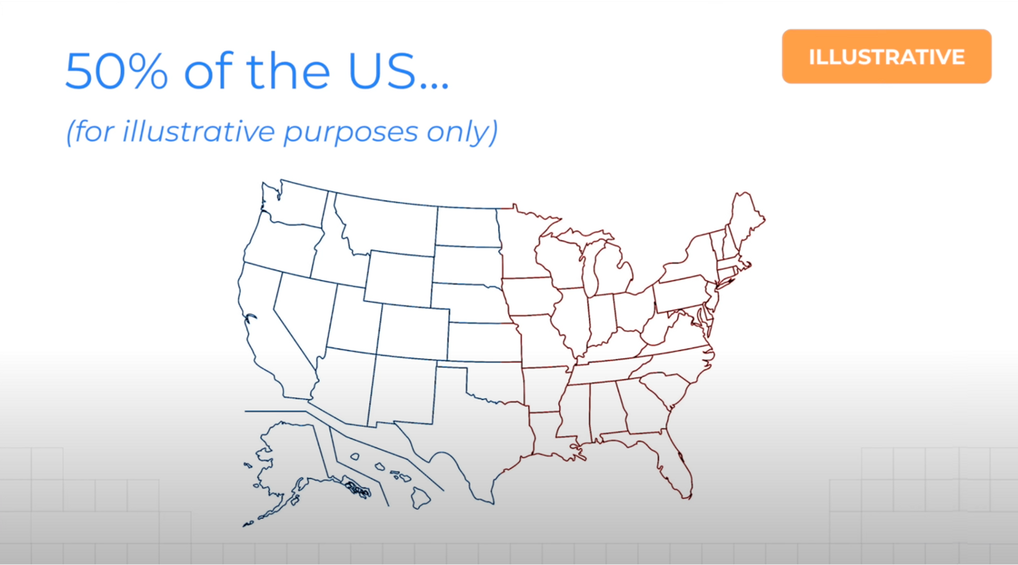
I find this one to be the funniest because it basically means you can get away with making stuff up.
No, all jokes aside, you use the illustrative sticker to make it clear that while the specific diagram or chart is not 100% accurate, the message you’re trying to convey holds true.
If so, check out my Succeed in the Workplace playlist!